Helvetica and the New York City Subway System
Book description
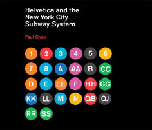
How New York City subways signage evolved from a “visual mess” to a uniform system with Helvetica triumphant.
For years, the signs in the New York City subway system were a bewildering hodge-podge of lettering styles, sizes, shapes, materials, colors, and messages. The original mosaics (dating from as early as…
Why read it?
1 author picked Helvetica and the New York City Subway System as one of their favorite books. Why do they recommend it?

Here is an example of a work that leaves no stone unturned, and does the job properly. There is an excellent introduction on the historical signage of the Subway, a proper explanation of why a new wayfinding system was necessary, the most comprehensive history on why Unimark was chosen to improve the signage and all the images you need of how their 1970 'Graphics Standards Manual' was implemented. Shaw rightly explains the move from the Standard Medium typeface to Helvetica and why it superseded Standard Medium and the fate of the original Unimark system.
From Mark's list on subways and urban trains.
Want books like Helvetica and the New York City Subway System?
Our community of 12,000+ authors has personally recommended 100 books like Helvetica and the New York City Subway System.
Browse books like Helvetica and the New York City Subway System
